Perspective design and Elements of design
What is perspective design?
Talking about art people have often had different opinions on how or what that piece of art looks like. Not just art there are a lot of natural things around us in our everyday life that we have a different understanding of as compared to others. You might be that person who has one particular travel mug for a particular reason whereas, on the contrary, you might be that person who always has a spare mug.
We often tend to get emotionally involved, not true in some cases, if someone has a different perspective or there is a dark theme in the frame. The dark theme here refers to the darkness of the night in natural scenarios and anything related to horror in artificial scenarios.
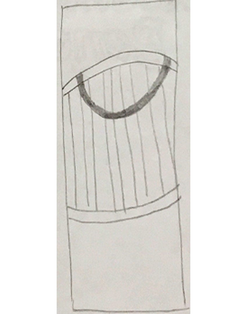
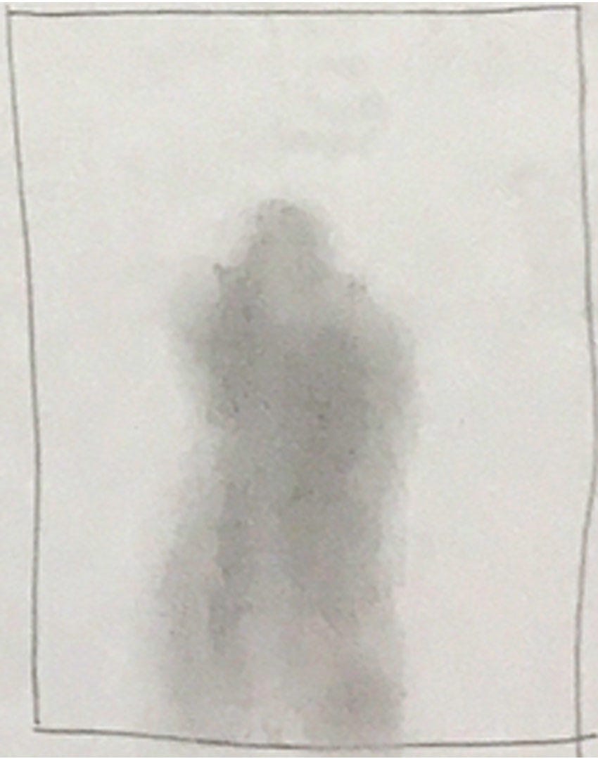
As an aspiring UI/UX designer I have come to learn about perception from different angles namely psychological and actual. I came to learn that psychologically humans perceive objects/structures/illustrations as a whole to identify or understand them by comparing them to anything they have seen or understood in their past, which means that it is completely dependent on the individual’s experience. Let’s put this to test, lets say that I have come across the image below,

If I have only seen headlights and taillights on the street then I will be left confused and terrified but I have seen that these are what a dog’s eyes look like in the dark then I will not be stunned at first glance.
Actual perception is something I came to understand by asking myself “What if I see something I have never seen or used before, something completely alien to me, how would someone even come to understand that?”. This has happened to humans since we existed like when we first saw fire! This is where things get interesting, many things that we couldn’t perceive have become a benchmark. Something that we don’t understand becomes a ‘hashtag’ in our brain. It is interesting to imagine how a person from before the invention of electricity illustrates Wi-Fi!
Perspective design is all in all a conceptual design where a person understands the design of a product/illustration/icon by comparing it to something that he has seen or experienced in this daily life so that he/she understands what they are looking at. There are three concepts that will help us achieve a design that will be natural to our eyes and easy to understand namely:
One point perspective
Two-point perspective
Three-point perspective
Perspective compositions on paper

Digital perspective compositions

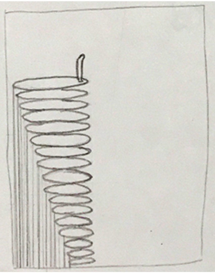
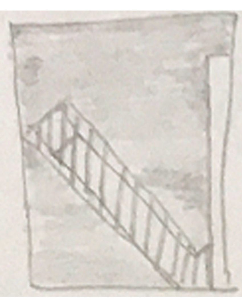
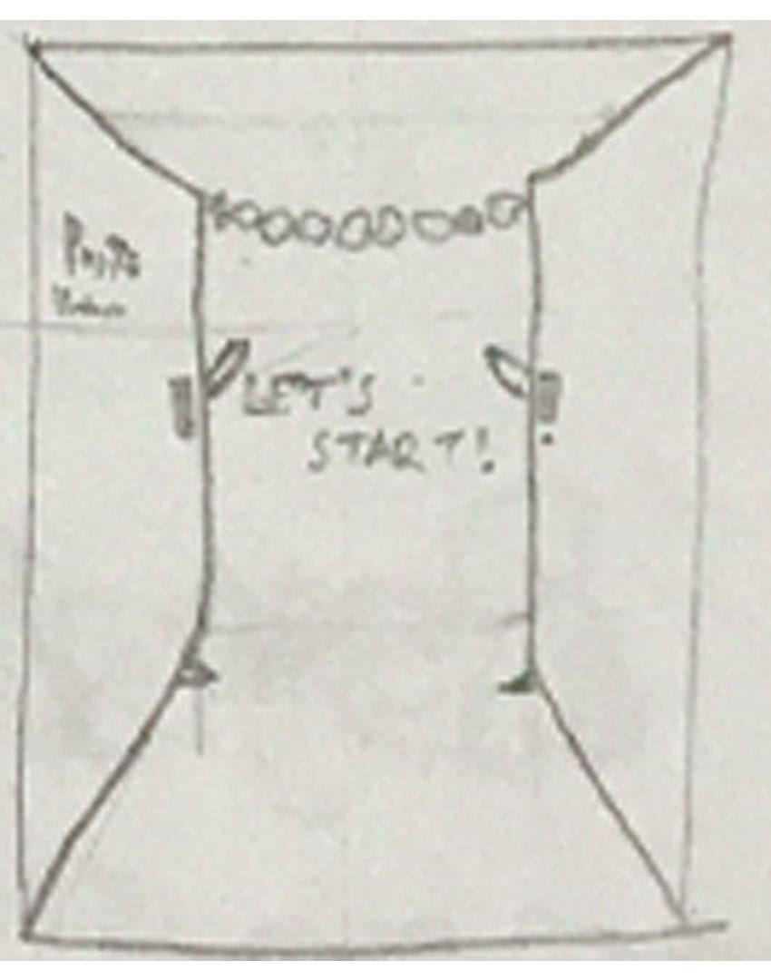
Generally whatever we see with our naked eyes, the objects will appear to converge or vanish at a distance. This is called the Vanishing Point. Although I am not an artist on paper I have made some compositions that follow this concept and objects appear more natural to the eye. I have also tried to implement this on Figma (above).
What are the elements of design?
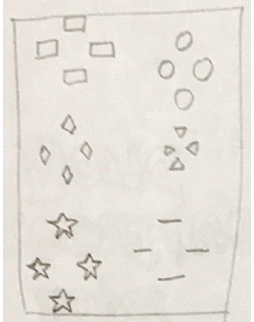
In design there are 7 principles that make it engaging and help us understand how we map or understand compositions. Further ahead in this document I have included some of my work when I was exploring these principles on paper and on Figma. Following is the list of principles that are stated under Gestalt for design:
- Closure
- Proximity
- Continuity: Elements arranged in a line or curve will stand apart from other elements.
- Similarity
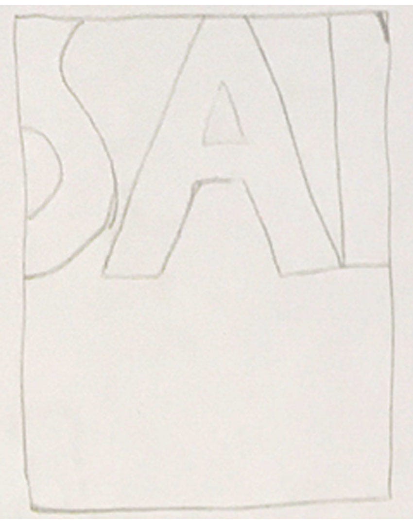
- Figure-Ground: This law examines how the eye can separate shapes in a design from the background of that design. Usually, we will interpret the larger area of an image as the background and the smaller part of the image as the foreground.
- Common-fate: Objects moving in the same direction depict a sense of continuity and give us a perspective.
- Focal point: What stands out visually will capture a user’s attention first. It makes you think why it is different.
I have also come to learn that we cannot make a composition that follows only one of the above mentioned principles. I have explored many elements and made some explorations on how they interact with each other. While I was exploring compositions I experienced that it is tough to make a composition which has a common perception for the artist and the viewers. I have come to recognize this issue and will try to improve this aspect in designing. I have great mentors and the learning curve I am going through now is very intriguing and exactly what I was looking for.
Challenges
The project was to come up with a hundred compositions in a week and one of the major challenge that I faced was to push my creative limit which exhausted me and I broke down at 65 compositions. Another challenge that I faced was to find elements. Many a times I had a concept in my mind with one element and I wanted to test it with other elements in-order to explore how we as humans will perceive it but not may elements will qualify as a match or complimentary to the concept I wanted to explore that’s where I had to find a new concept with other element. Sometimes I felt like I was influenced my natural elements around me. Although I was not supposed to get influenced by natural elements but I still gave them a try in the end because I had nothing else to scribble about. Challenges faced here doesn’t mean a stop, this only means that I have found hurdles on my journey to becoming a UI/UX designer. Now I know where I need to put effort and require more time to get a finished design.
Further ahead I have finalized 20 of my best compositions, 10 of which I have done on digital platforms and the remaining on paper as they are a little complicated for digital platform.
Digital compositions
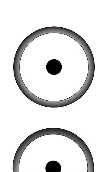
The image on the left is a poor demonstration of a very powerful speaker, it is powerful because all it does is set your eyes right at the center dark circle and won’t let them off.
The image on the right is a pattern that just inspired me because I brought curved lines crazy close to each other and they made 3 different shapes in a pattern.
The left image is a concept of freedom. A learning curve in a individual’s life can be inverted as compered to other’s but they tend to learn the same lessons in life.
The right image hit me differently when I make circles but there is a gap that irritates me every-time I see this illustration.
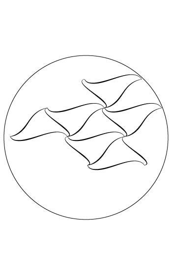
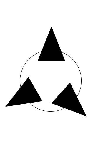
The left image appears naturally uplifting and motivating.
The right image is makes me wonder every-time if I wanted to make it look like a sphere of wanted to see how would a circle maintain consistency be tween 3 poorly placed triangles.
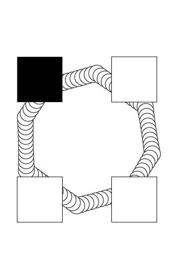
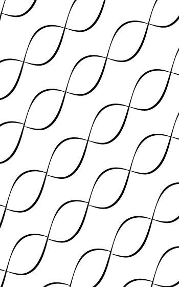
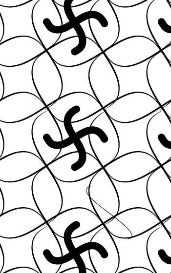
The left image is one of my best explorations. I discovered that some principles can counter some of the principles stated by Gestalt.
The right image is a pattern using a single curved line with varying thickness. Seems like they got entangled and locked together infinitely.

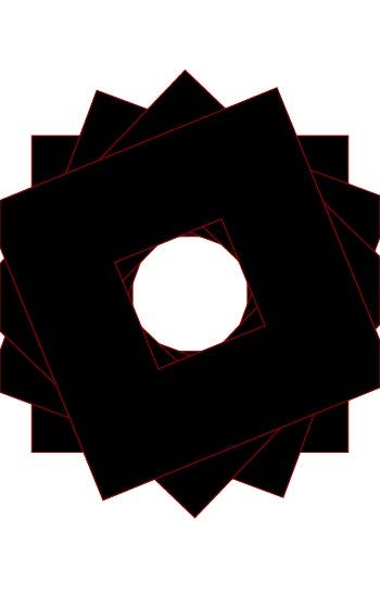
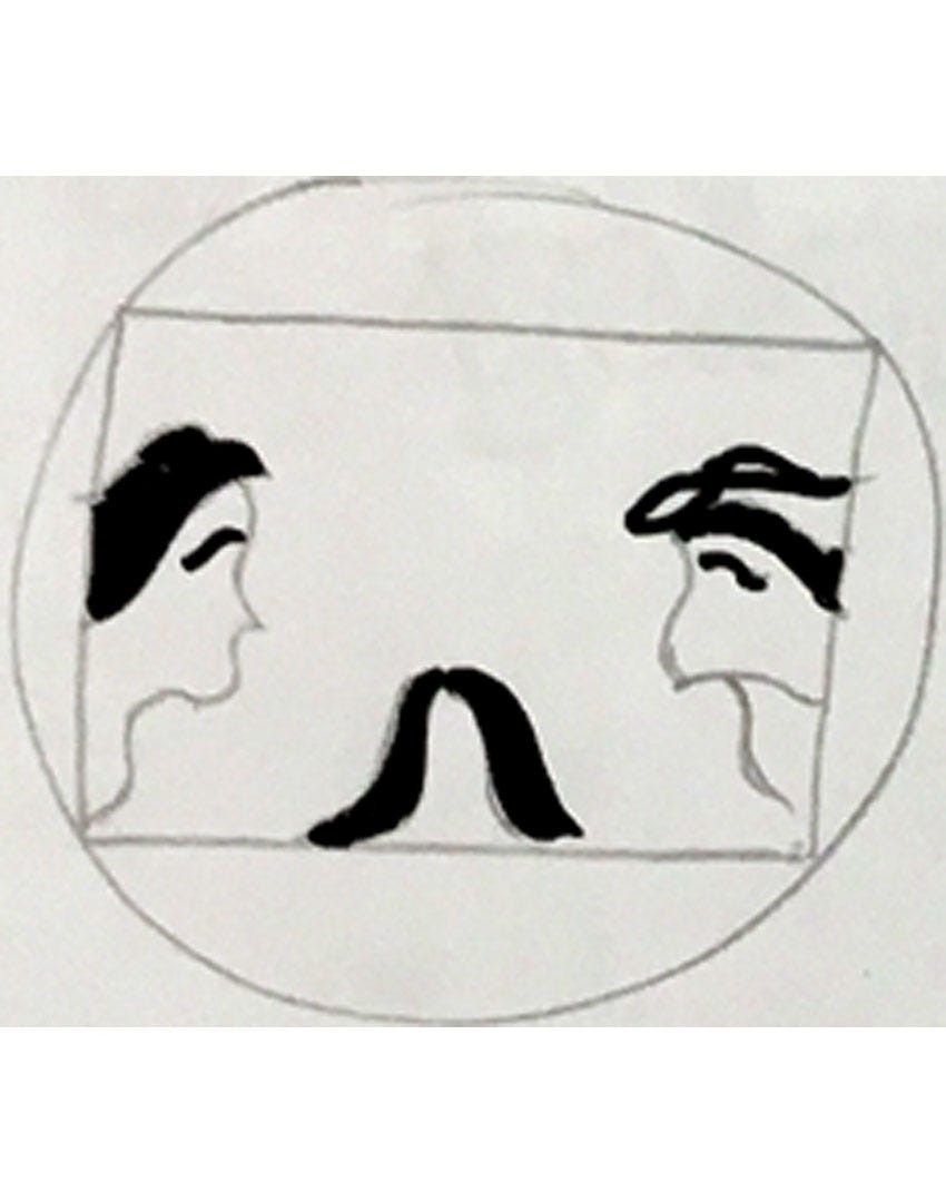
The left image is definitely a face, do you see anything else?
The right image is many perfect squares stacked on one other and looks the shutter of a camera opening.
Compositions on paper
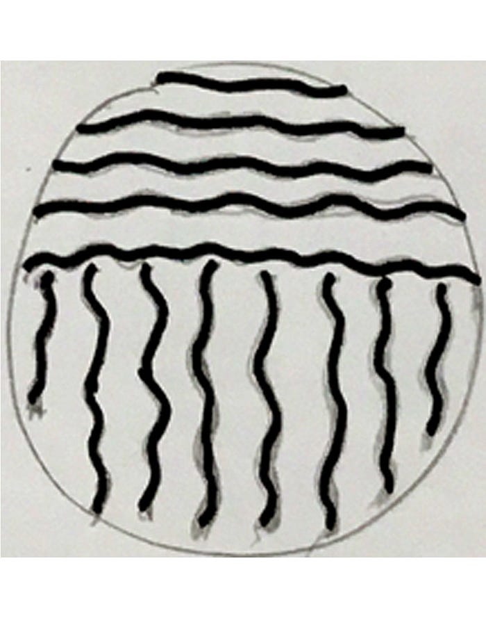
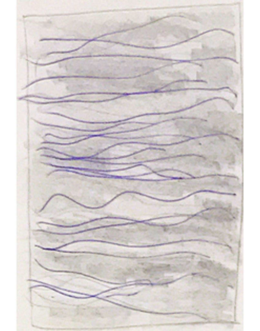
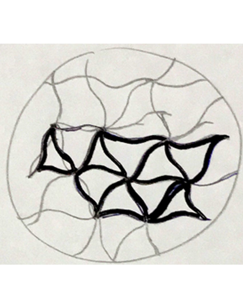
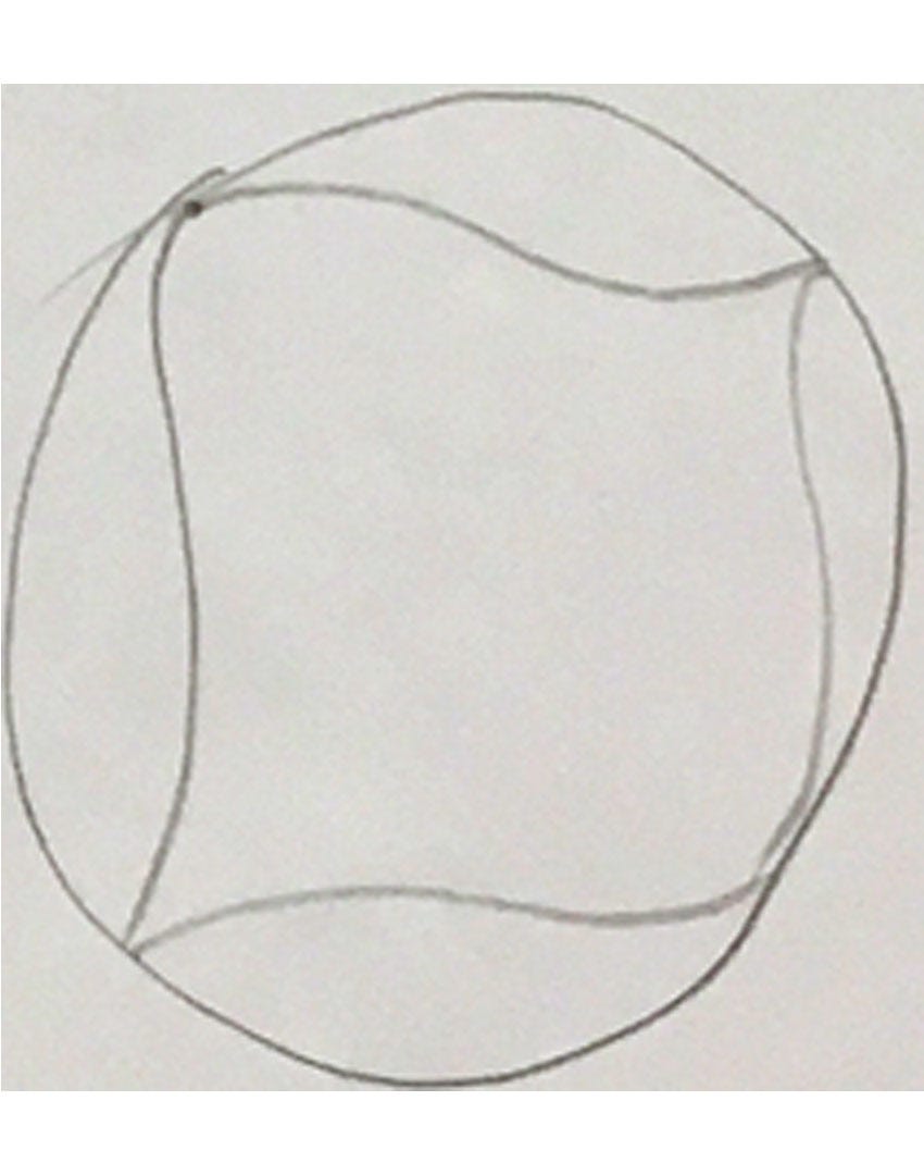
Curved lines can change directions without completely disrupting the
continuity of the flow or a sense of direction. Hand drawn lines are not perfect but still add a natural feel to the viewer.
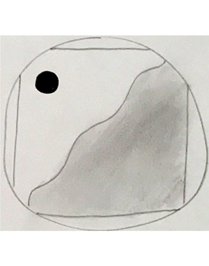
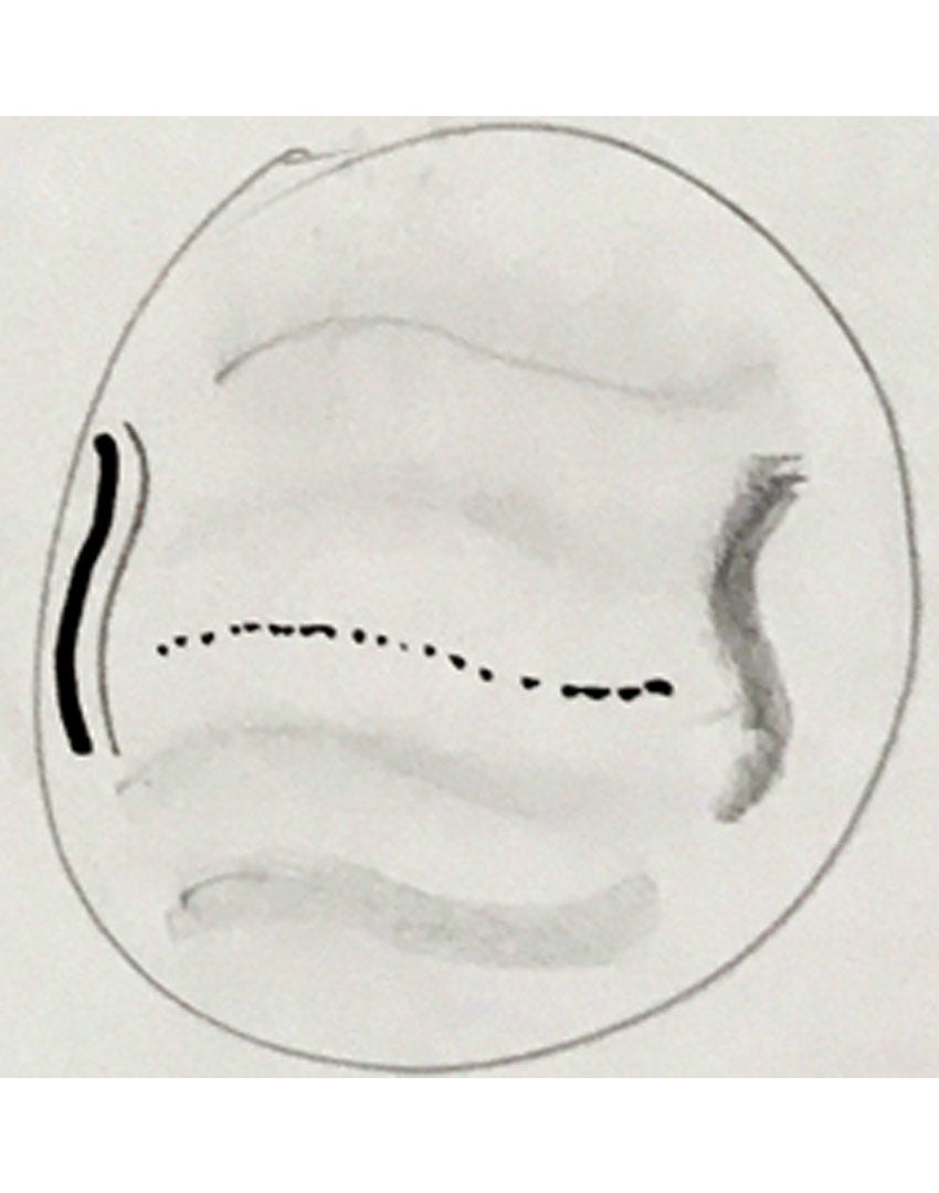
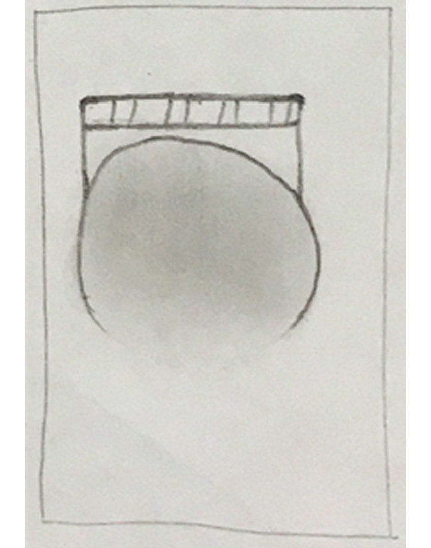
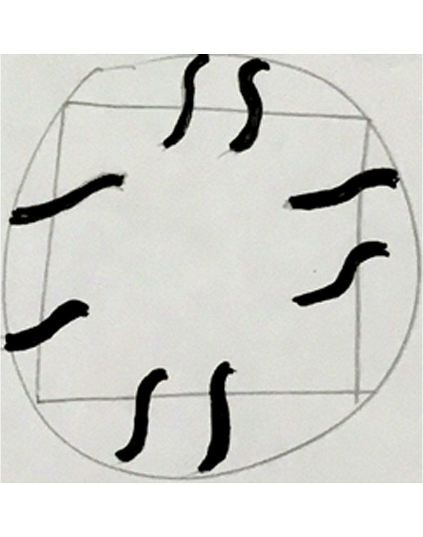
This composition will try to get you attention 2 ways. I did not have the dark circle at first but when I kept staring at it I managed to strike a balance for the focus between both the regions. The incomplete rectangle inside the circle is kind of a petri dish and the circle is a perspective from a lens of a magnifying glass.

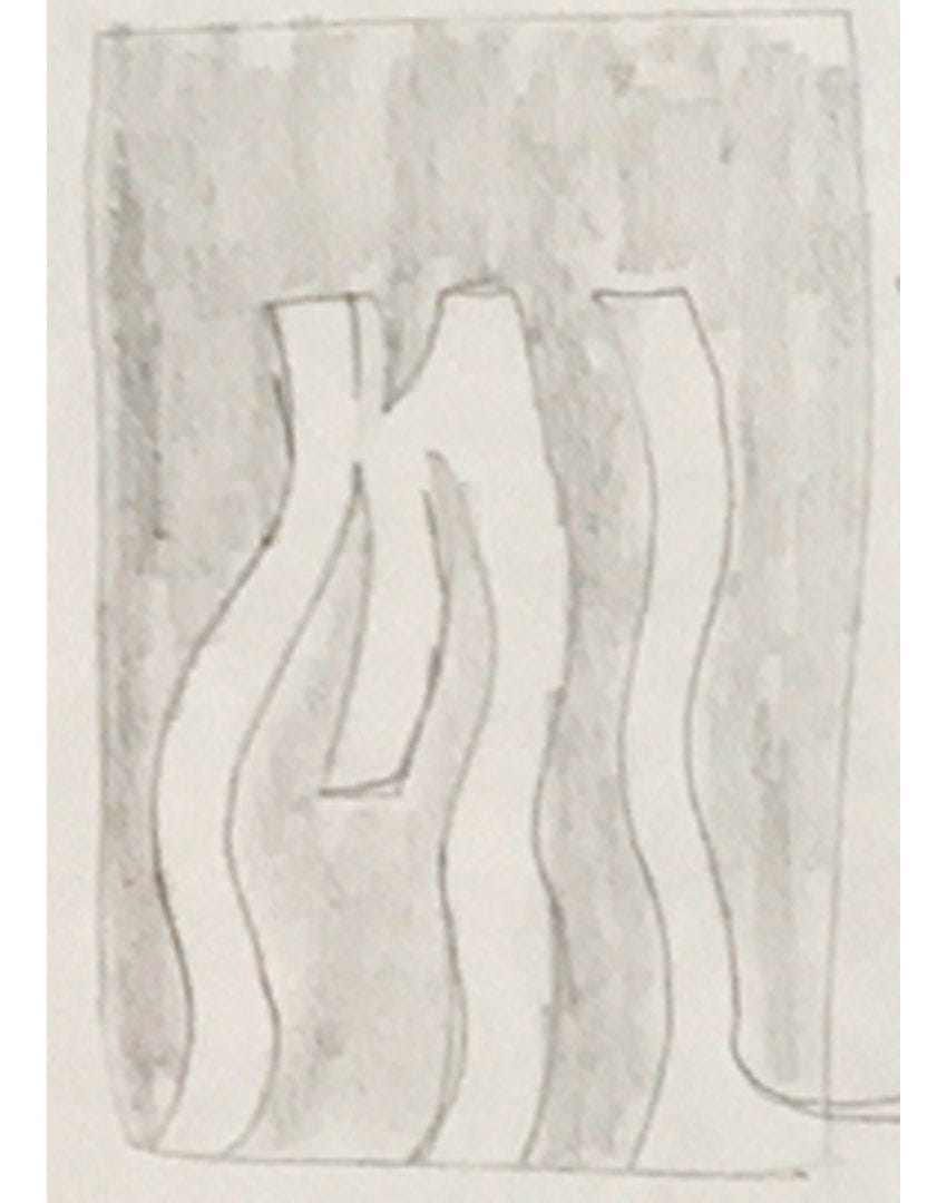
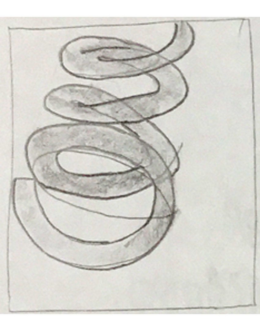
A creature with curved body experiencing all similar curves around it making up it’s surroundings. This composition is also magnified.
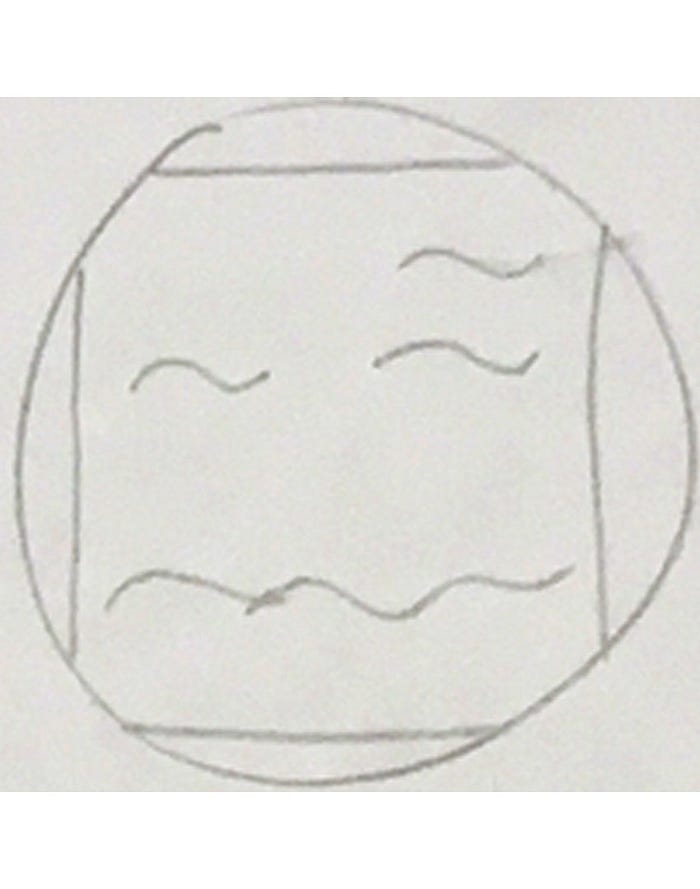
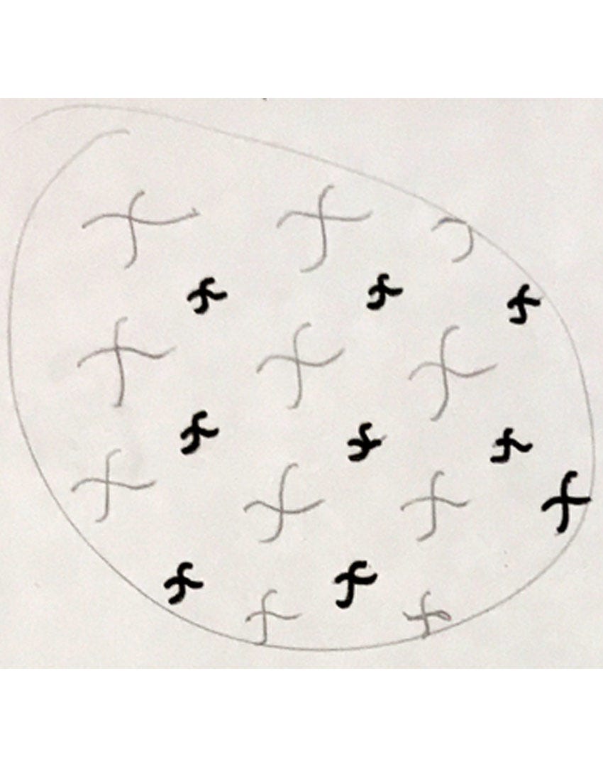
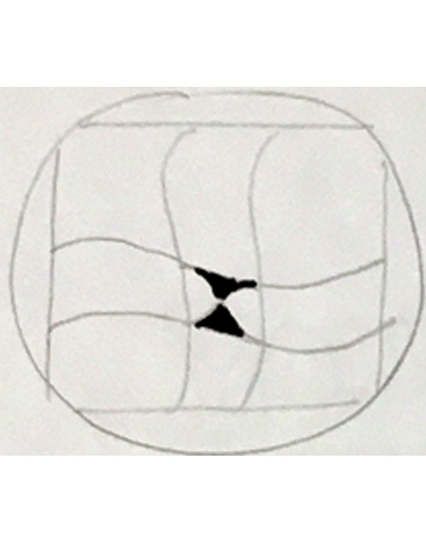
These curves try to make you a little confused and uncomfortable. Also magnified.
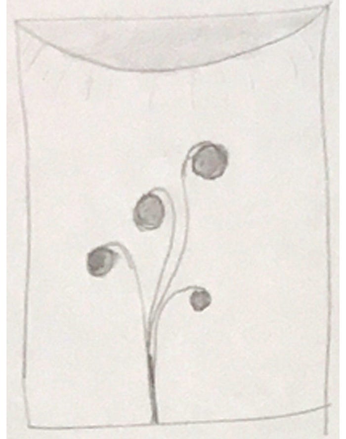
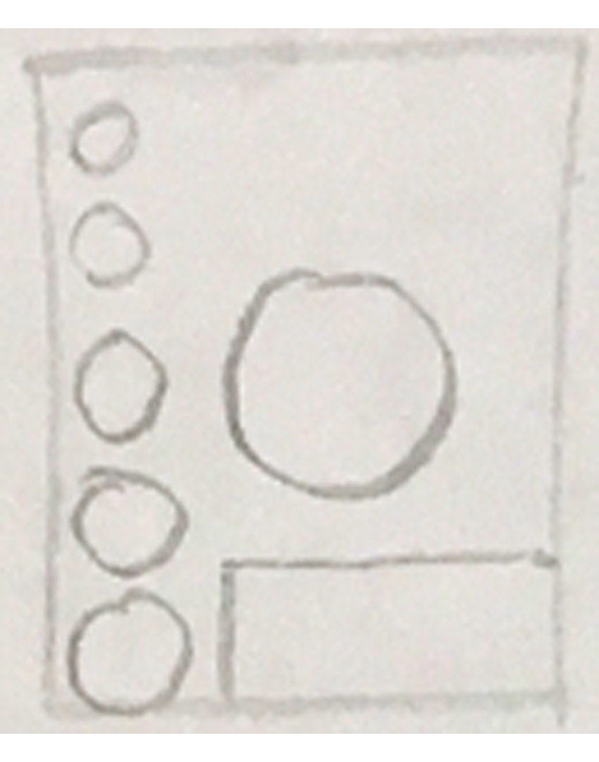
I took two elements, the circles and the lines, and played with the orientation. It become interesting ahead.

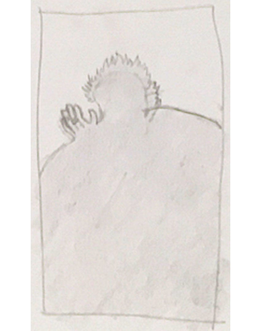
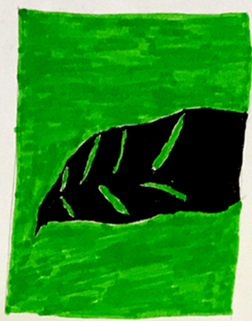
Here it looks like the sun is setting if the plant is on ground or probably just a cactus beside the plant.
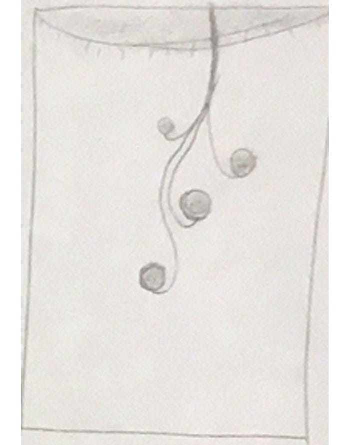
Here the plant seems to have found land where the sun has completely set or was it the plant was rotating and not the sun? I did not put these compositions together on purpose because they are not related to a single concept.
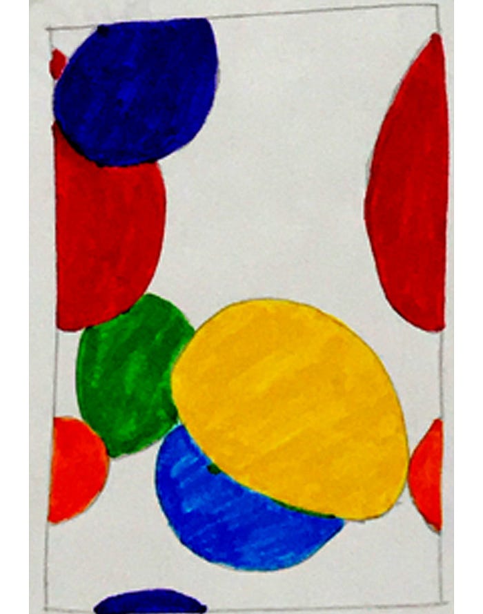
This is not just balloons or spheres in space, align more similar tiles together in any orientation and they will fit together perfectly!

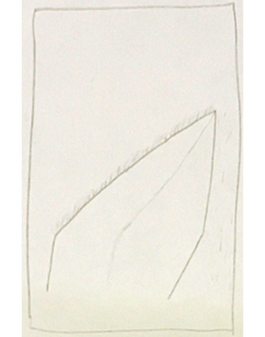
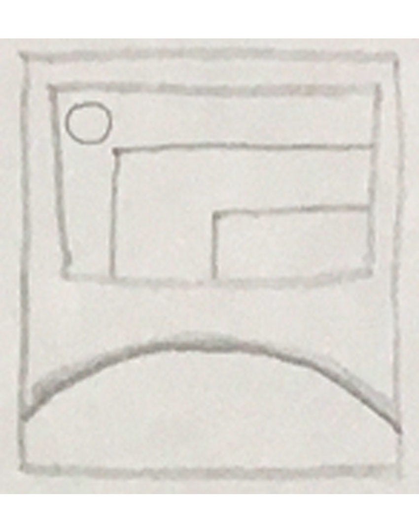
One of the building in this composition has sharp edge and the other doesn’t.
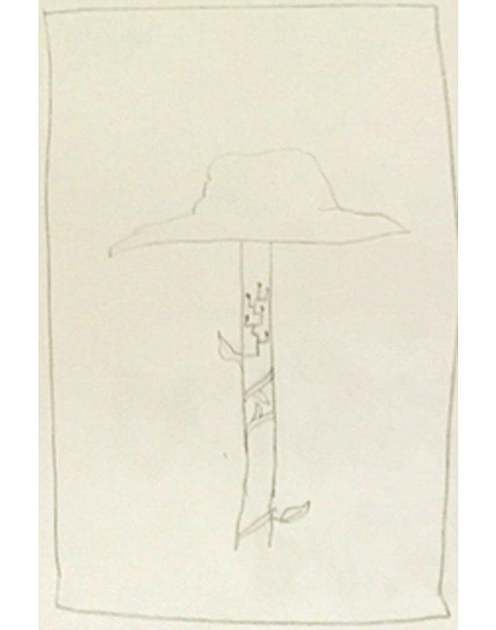
Hat on a stick or probably how I would have made a pickaxe.
Conclusion
To conclude my documentation I would love to get some feedback in the comments section on my experience about my explorations on some design concepts that I learned along this path. Some of the designs which I felt would not fit in context are put below.
Thank you for your time. Next stop, leap two steps ahead!

